


Ay Caramba! – ENG.
The design team at FOX Latin America trusted us to design the brand-new custom type family for No Molestar! tv show, home of The Simpsons at FOX Channel.
It meant a real challenge for us which involved the development of a sans serif typographic system –including three text fonts and one full of icons–, to provide a new kind of voice for the complete rebranding of the show.
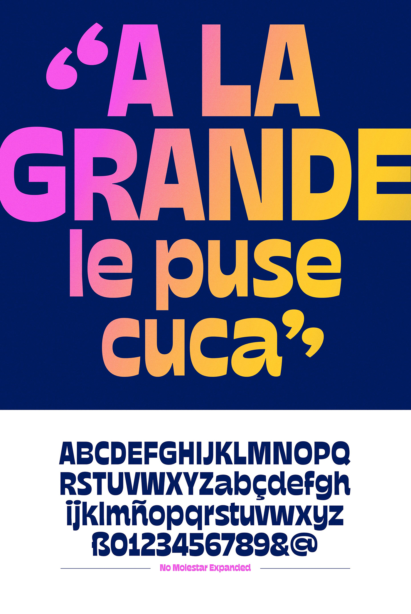
Regarding the family, its morphologic DNA responds to the show’s personality, which can be described as irreverent, mischievous, cocky, and absurd. In that way we built from the ground up a display Sans Serif system governed by an inverted contrast essence, with a notable typographic color and open counterforms to improve legibility.
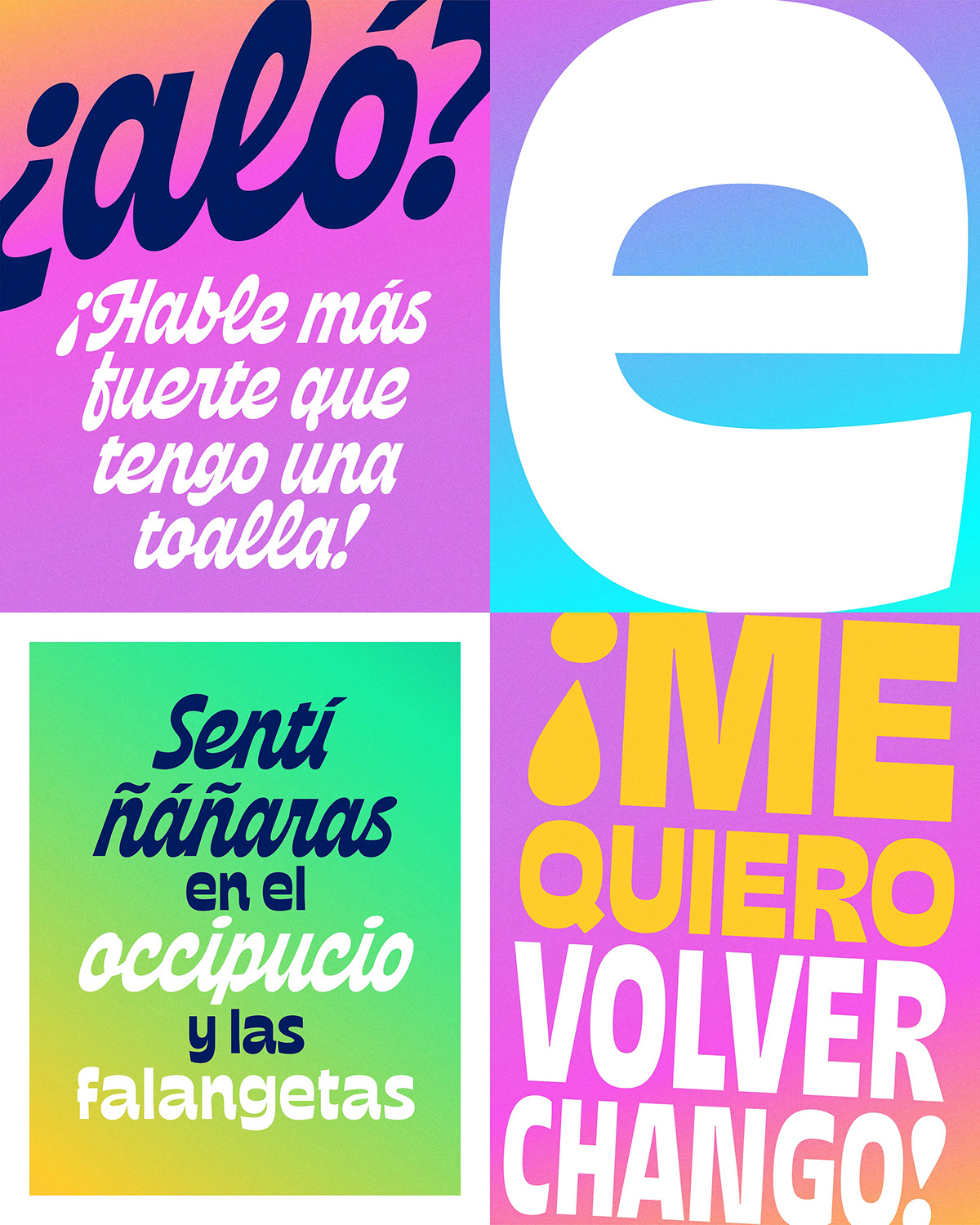
The family consists of four fonts in total. The two Sans Serif fonts were meant to compose titles with two tones of voice; the Condensed version to create strong messages with high impact and the Expanded to make words stand out. The Script reinforces that inverted contrast idea, starting out from an italic version of the Condensed, but then turning into an authentic cursive. Just like a fresh breeze of air, it allows the tv show to speak with informality, grace and a great deal of irony. Finally, a font full of icons serve as a complement to build different types of messages and arrange information.
“No Molestar” type family shines on air through bumpers and animations showing the show’s rebrand, designed by the incredibly talented team at Fox Latin American Channels.

¡Ay Caramba! – ESP.
El equipo de diseño en FOX Latinoamérica nos contactó para desarrollar la nueva familia tipográfica para el bloque «No Molestar!”, hogar de Los Simpsons en FOX Channel.
Significó un gran desafío que involucró el desarrollo de una familia tipográfica sans serif –formada por tres variables de texto y una variable llena de íconos–, que le brinde una nueva voz al show junto a su completo rebranding.
Sobre la familia tipográfica, su ADN responde a la personalidad del show –irreverente, travieso, arrogante, y absurdo. Teniendo esto en mente construimos desde cero un sistema Sans Serif display regido por un trazo de contraste invertido, con un color tipográfico notable y contraformas bien abiertas para reforzar la legibilidad.
La familia consiste en cuatro variables en total. Las dos Sans Serif fueron creadas para componer títulos con dos tonos de voz; Condensada para crear mensajes de gran impacto y Expandida para hacer que se destaquen. La Script refuerza la idea de contraste invertido, partiendo de una versión inclinada de la Condensada, pero luego convirtiéndose en una auténtica cursiva. Como una brisa de aire fresco, brinda la posibilidad de hablar con informalidad, gracia y una cuota de ironía. Finalmente, se suma una fuente llena de íconos como complemento para construir diferentes tipos de mensajes y jerarquizar la información.
La familia tipográfica «No Molestar» brilla al aire en bumpers y animaciones que muestran el rebranding, diseñado por el talentoso equipo de Fox Latin American Channels.


Credits / Créditos
— Stills —
Graphic and Type Design: Yani Arabena & Guille Vizzari (Yani&Guille)
— Bumpers —
Art Director: Nicolás Sarsotti
Design and Animation: Bruno Daneri, Lucas Rocha, Paula Alvarez di Mauro
Script: Ernesto Sifreddi
Música: Pablo Siciliano
Type Design: Yani&Guille
VP: André Takeda


